10 Visual Arguments, Media and Advertising
Andrew Gurevich

Visual Arguments
In this chapter, we will be exploring the use of visuals (images, charts, graphs, etc.) in the presentation of arguments. Like any other piece of support, images and other visuals are compelling when used correctly. They also can be used in ways that contribute to all of the flaws, fallacies, and faulty reasoning we have been exploring all along. Images can support written or spoken arguments or become the arguments themselves. They hold great power in advertising, journalism, politics, academia, and many other areas of our media-managed perceptions of the world around us. As such they deserve our attention here as we continue our discussion of the analysis and construction of valid arguments.
When we say “argument,” we usually think of either spoken or written arguments. However, arguments can be made in all forms, including visual arguments. Visual arguments rely on images to persuade a viewer to believe or do something. Advertisements in magazines are often types of visual arguments. But there are many other examples to consider, each with their own particular set of parameters to evaluate in pursuit of analyzing and constructing valid arguments.
Basically, a visual argument is a supporting (or rebuttal) statement. It utilizes various images to intensify the effect on the audience. It is undoubtedly true that pictures or other visual art pieces help engage a wider range of people. In addition, images sometimes may reflect the values and beliefs of the culture. Thus, visuals arguments are more appealing to the public than verbal ones.
Exploring the usage of the images as a way of conveying the message requires substantial research. That is why visual rhetoric should be examined. The desire to watch a movie, streaming series, or a cartoon is probably familiar to everyone. Though, not everyone notices when it happens after seeing a poster. Most of us are unaware of how bombarded we are with visual rhetoric and the extent to which it actually does influence our thoughts and behaviors. But it’s not all nefarious. A bright advertising picture can lead to taking part in a charity event, as well, or lead people to donate money or blood to victims of a natural disaster or war. Such experiences may be deeply personal and at the same time shared by the majority of people within a society, culture, or subculture. These are just a few examples of the vast impact of visual rhetoric on the public mind. By employing visual rhetoric, the author can lead the reader/viewer to different outcomes. For instance, they can induce compassion, anger, fear, curiosity, etc.
Marketing companies often use visual rhetoric to the advantages. It can become an effective way for a successful product or a service promotion. Visual argument advertisements are often the most effective in persuading consumers to make a purchase, because they can communicate a lot of information, and more importantly emotional impact, very quickly. The “father” of this science, first called “public relations,” was a man by the name of Edward Bernays, who was none other than the nephew of the famous Swiss psychologist Sigmund Freud. In fact, Bernays used many of his uncle’s theories about the human mind to craft the basic models of the advertising industry that are still very much employed today. We will watch a film about the history of the advertising industry, and Ed Bernays in particular, below. But for now, it is important to understand how visual argument works and what the best practices are for using it effectively, ethically, and creatively to support the arguments you make in academic contexts.
Say you are at the doctor’s office in the waiting room, and you see an advertisement that has a beautiful model sitting in a Lexus driving down a long, open road. The image may evoke some feelings of inadequacy (“I’ll never be as pretty as her”), freedom (the long, winding road), and envy. All of these work together as an “argument” to convince you that a Lexus will change your life, and you will be as beautiful and as free as the model if you only had one. On a rational level, we know none of this is true. But the ad does not speak to our rational minds. It speaks to a more irrational place, the subconscious, where our desires and thoughts often mix with memories, projections, fears, and other phobias to encourage an irrational response to the stimulus. As we can already see, like with other forms of arguments, visual arguments may contain logical fallacies or use (and misuse) rhetorical appeals to persuade the viewer. Our job is to learn to spot the misuse of them, and to also use them ethically, accurately, and responsibly in our own argumentative contexts.
Learning to decode visual arguments can be challenging. We are bombarded with images every day and are often unaware of how they affect us. For instance, did you know that red, yellow, orange, and green make us hungry? Think about fast food chains. How many of them use one, or more, of those colors in their logo or design? In movies, we associate black with bad and white with good. In Star Wars, Darth Vader wears a black cloak, while Luke Skywalker often has light clothing. If a political cartoon showed a politician speaking in Times New Roman font and another politician speaking in Comic Sans, then it could be implying that one politician is serious while the other is childish. We tend to think of “visual” to mean only pictures, but learning to recognize how not just images, but color, layout, perspective, and even font choices, can affect people and influence their thoughts and choices can help you to hone your visual literacy and learn how to identify and evaluate visual arguments.
Adding visual elements to a persuasive argument can often strengthen its persuasive effect. There are two main types of visual elements: quantitative visuals and qualitative visuals.
Quantitative visuals present data graphically. They allow the audience to see statistics spatially. The purpose of using quantitative visuals is to make logical appeals to the audience. For example, sometimes it is easier to understand the disparity in certain statistics if you can see how the disparity looks graphically. Bar graphs, pie charts, Venn diagrams, histograms, and line graphs are all ways of presenting quantitative data in spatial dimensions.
Qualitative visuals present images that appeal to the audience’s emotions. Photographs and pictorial images are examples of qualitative visuals. Such images often try to convey a story, and seeing an actual example can carry more power than hearing or reading about the example. For example, one image of a child suffering from malnutrition will likely have more of an emotional impact than pages dedicated to describing that same condition in writing.
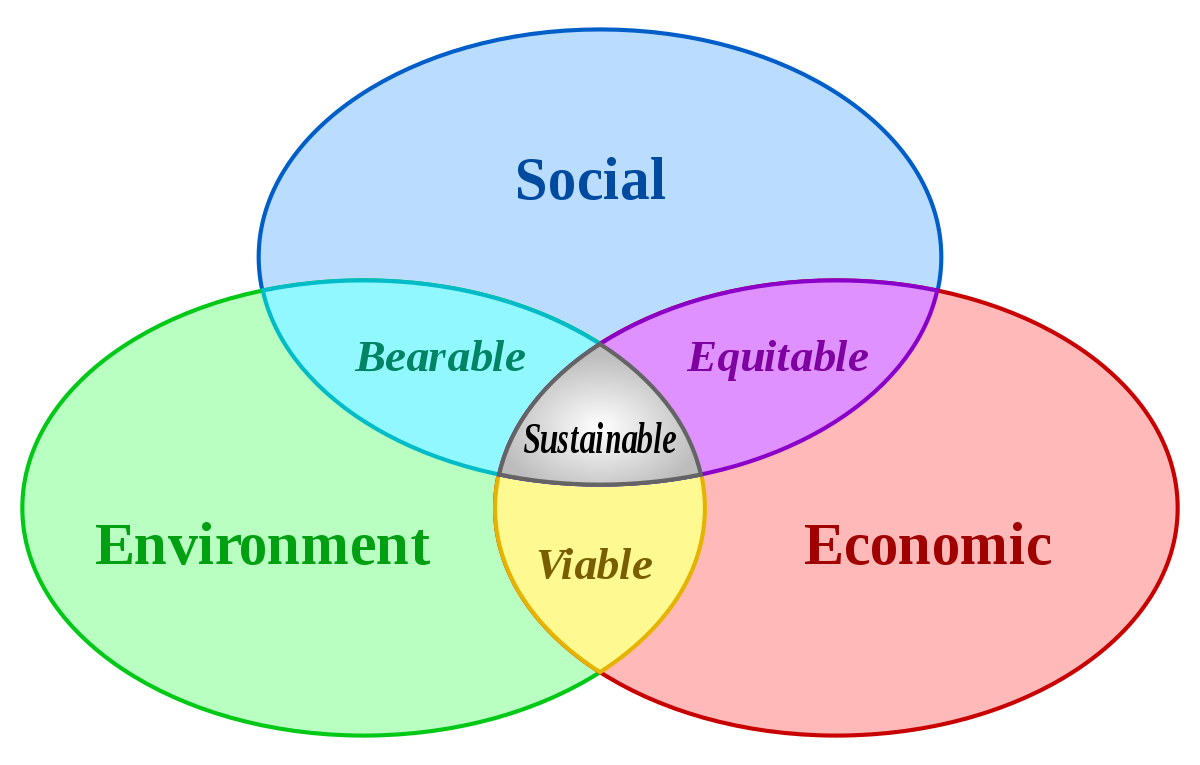
The Venn diagram above is a great example of how an image can be used effectively to communicate a complicated idea rather quickly and efficiently. Here, we can see that “sustainability” is defined as the intersection of environmental, economic, and social concerns, for instance. Proper use of visuals can help us connect with an audience’s emotions and values, build credibility, and share data and logical information in memorable and engaging ways.
- Review the handout: Ideographs
- Review the document: Conducting Visual Arguments
Visual Argument Example: Gatorade Ad
Among the diversity of visual arguments, advertisers provide some of the most powerful examples. Let’s examine a visual argument for Gatorade—a drink for sportspeople. It illustrates the supposed superiority of the Gatorade drink, among other beverages. A bright picture of the bottle and a memorable slogan are a marketing specialist’s craft. It combines three main aspects of a successful visual ad: use of colors, “supernatural” power, and shock appeal.
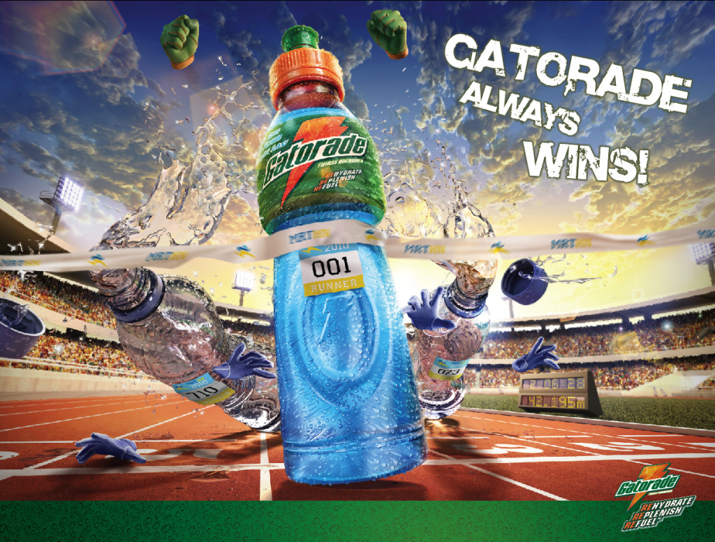
The developers of the given visual ad reached a perfect mix of colors. The dominating ones of the poster are blue and green, which are generally considered to be “natural” ones. Nothing can be more powerful than “nature.” These are also the colors of “sport”. The colors of the grass and the sky. This idea serves as the hidden message of this color combination. As a result of this color mixing technique, the ad creator reaches its primary goal—the assurance of success in the race!
In addition to an effective color combination, the advertisement reflects a concept in advertising often referred to as “supernatural power.” The image illustrates the bright container with the Gatorade drink pulling away from the others and dramatically winning the race. Moreover, it seems that the bottle with the advertised drink is “reaching for the sky.” This detail makes the ad even more eye-appealing and further suggests the one who has the drink will have the same power.
The rhetorical analysis helps to understand that the trick of placing the bottle ahead of other beverages is exceptionally effective. It persuades the audience to believe that Gatorade provides the drink takers with supernatural power. Hence, it motivates the target audience to purchase the beverage. The advertisement compares the athletes to the Gatorade. Thus, it convinces them that they will show excellent performance in the competition, as Gatorade does in the visual ad.
Apart from the use of colors and supernatural power, the given visual argument image implements other methods. For example, it uses a shock appeal technique. The ad demonstrates a real-life race, but with a metaphorical contestant—the Gatorade bottle. Consider the effect of “reaching the sky” by the container. It creates a vision of an incredibly strong nature of this beverage. As a result, the audience is “shocked” by Gatorade’s supernatural power and encouraged to buy it. Consequently, a shock appeal makes the visual argument images more effective. We will return to the ways advertisers and politicians use visuals to persuade us later, but for now let us look at the academic ways to both analyze and use visuals in argument.
- View the vidcast: Purdue OWL – Visual Rhetoric
- View the video: Visual Arguments Essay
- View the video: Visual Arguments
Visuals in Advertising and Social Media
The following video content explores how visual stimuli impacts the ways we think, believe, and behave in the world. We begin by returning to the beginning of the discussion about Edward Bernays, the “father” of modern advertising and the nephew of Sigmund Freud. After that, we look at the more modern impacts of visuals on social media in young people with an informative Frontline episode with the media analyst Douglas Rushkoff:
- View the film: The Century of the Self – Happiness Machines
- View the film: Generation Like
